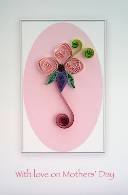
Anyway, I thought this frame would make an attractive background for a Mothers' Day design, and this time I've added colour to the background in the form of a delicate pink oval. The pink flowers were made by 'fold-rolling' two pink strips together (one metallic-edged, one plain) and releasing them to create these Art Deco style blooms. Today's colours are deliberately more pastel than the ones I used yesterday, but I could not resist the dark red 'ribbon' and some open coils in my favourite lime green!
UPDATE ...
Following Ann's brilliant tip (see comments below) I've managed to reduce the greyness of the photo as you can see here:
The section around the pink oval still looks slightly whiter because it printed as solid white within the frame. I guess that shows that my white cards aren't as white as I thought they were!! Anyway, thanks for the very useful tip, Ann!


Lovely card Philipa!! Like the colour combination ☺
ReplyDeletenice job as usual, like how you did the shadow!
ReplyDeletePaula
Another lovely card. i really like the frame.
ReplyDeleteIf you want to get rid of the grayish tint in the white you can do that in photoshop.
Click on enhance > adjust color > remove color cast. You'll get a little eyedropper and you can click that on any part of the picture that should be either white, gray or black. It automatically fixes the tone
Lovely card!
ReplyDeleteLove the card!
ReplyDeleteThe soft colours are so perfect for a Mothers day card!
Keep rocking!
Thanks for your comments, everyone. I'm off to the market now with this card in my box - let's see if I can sell it!
ReplyDeleteIt looks so much like the quilling is framed. Nice effect.
ReplyDeleteThanks Suganthi!
ReplyDelete